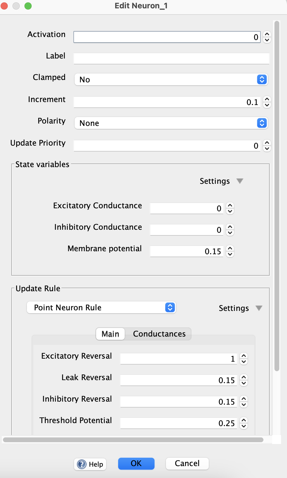
Property Editors
Simbrain includes a sophisticated system for automating the process of creating dialogs to edit properties of objects. The system automatically generates appropriate widgets based on annotations in the code. These dialogs have a familiar look and feel, and certain standard behaviors when editing single objects or groups of objects in Simbrain.
Supported Property Types
The editor automatically selects the appropriate widget based on property type:
- Numeric types (Int, Long, Short, Float, Double): Spinners with validation
- Boolean: Checkbox with three states (Yes/No/Null for multi-object editing)
- String: Text field with optional file chooser button
- Enum: Dropdown with all enum values
- Color: Color picker button
- Arrays (DoubleArray, IntArray, BooleanArray, String Array): Embedded table editors
- Matrix: Embedded table for matrix editing
-
Tensors: Embedded tensor editors for multi-dimensional array data such as tensor layer activations, biases, and convolution kernels. Tensor editors use tabs to organize higher-dimensional data, including nested tabs for tensors with multiple non-table axes.
- Objects (CopyableObject, EditableObject): Nested editors with type selection dropdown and collapsible details
Annotation Feature
Properties can be configured using the @UserParameter annotation (Java and Kotlin) or the GuiEditable delegation (Kotlin only).
Common Configuration Options
- label: Display name for the property
- description: Tooltip text shown on hover
- minimumValue / maximumValue: Validation bounds for numeric fields
- increment: Step size for spinner up/down arrows
- order: Display order in the dialog (lower numbers appear first)
- tab: Tab name for organizing properties into tabs
- displayOnly: Show value but don’t allow editing
- showDetails: For object types, whether the detail triangle is initially expanded
- columnMode: Display arrays as columns instead of rows
- useFileChooser: Add a file browser button next to string fields
Advanced Features (GuiEditable only)
Kotlin code using GuiEditable delegation can access additional features:
- conditionallyEnabledBy / conditionallyVisibleBy: Link a property’s enabled/visible state to a boolean property
- useCheckboxFrom: Add an enabling checkbox next to the widget
- custom getter/setter: Use custom logic when reading/writing values
- onUpdate: Execute custom code when properties change, allowing widgets to respond to each other
- typeMapProvider: Specify a custom function to determine available types for object properties
Multi-Object Editing
When editing multiple objects simultaneously:
- If all objects have the same value, that value is shown
- If objects have different values, “…” is displayed
- Null values are ignored when committing changes
- Only modified fields are written back to the objects
Widget Interaction
The onUpdate feature allows widgets to interact dynamically:
- Query values from other widgets using
widgetValue(::propertyName) - Enable/disable widgets conditionally with
enableWidget(boolean) - Show/hide widgets with
showWidget(boolean) - Refresh widget values programmatically with
refreshValue(newValue)
This enables sophisticated UI behaviors like hiding irrelevant options or updating dependent fields automatically.