Bar Chart
A standard bar chart that can be used to represent changing set of quantities, using a vector coupling. For example, it is often useful to represent the activations of a group of neurons using bar chart and to watch how they change in time as the simulation runs, to get a sense of the relative activation of each neuron.
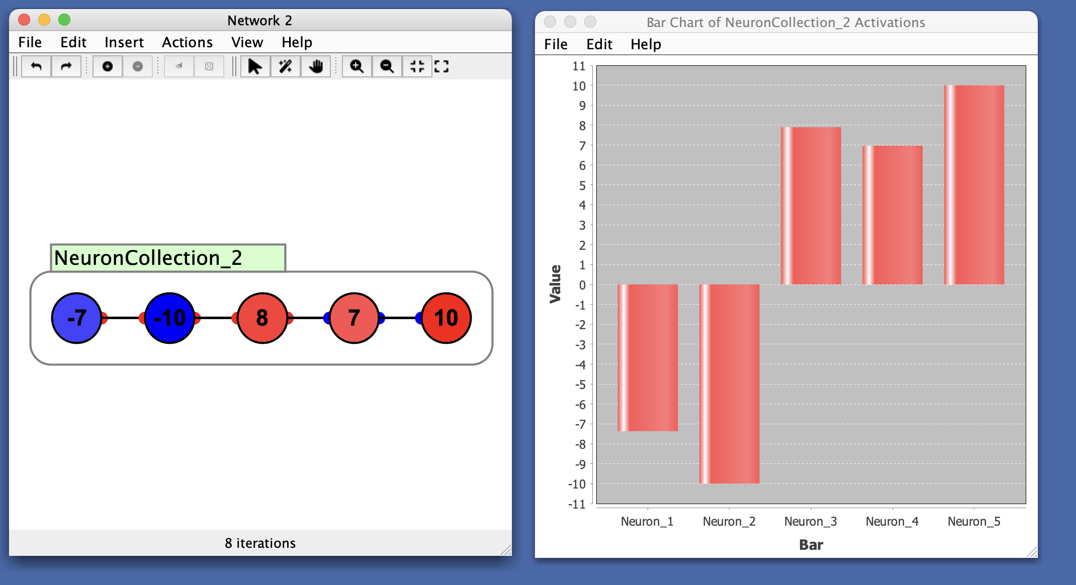
In this example, notice the first two nodes are negative and last three are positive, which is reflected in the chart.
Preferences
- Lower Bound: Minimum value of the y-axis.
- Upper Bound: Maximum value of the y-axis.
- Auto Range: When checked, automatically scales the y-axis so that the largest bar fits inside the window. It can be useful to turn this off to get a better sense of overall changes in magnitude, since while it is on the bars will fill up the window.
When auto range is enabled, the y-axis continuously adjusts to fit the current data. This can make values appear very small while still maintaining their relative proportions, which can create a misleading impression that some values are larger than others when they’re actually just scaled differently. A similar issue can occur in time series plots where auto-range can make it appear that error is improving when the scale is simply adjusting. Consider turning off auto range when you need to accurately assess absolute magnitudes or compare values across different time periods.
- Bar Color: Color of the bars in the chart.
Menus
File
- Import from XML: Load a previously saved bar chart.
- Export to XML: Save the current bar chart.
- Rename: Rename the bar chart window.
- Close: Close the plot window.
Edit
- Preferences: See preferences.
Right-Click Menu
- The context menu is a JFreeChart menu.