Heat Map
A heat map records a vector of continuous values at each workspace update and displays the result as a color-coded image. Time runs along the horizontal axis, and each row represents one element of the incoming vector. It is useful for viewing population activity, repeated trials, or any changing vector whose magnitude and pattern matter together.
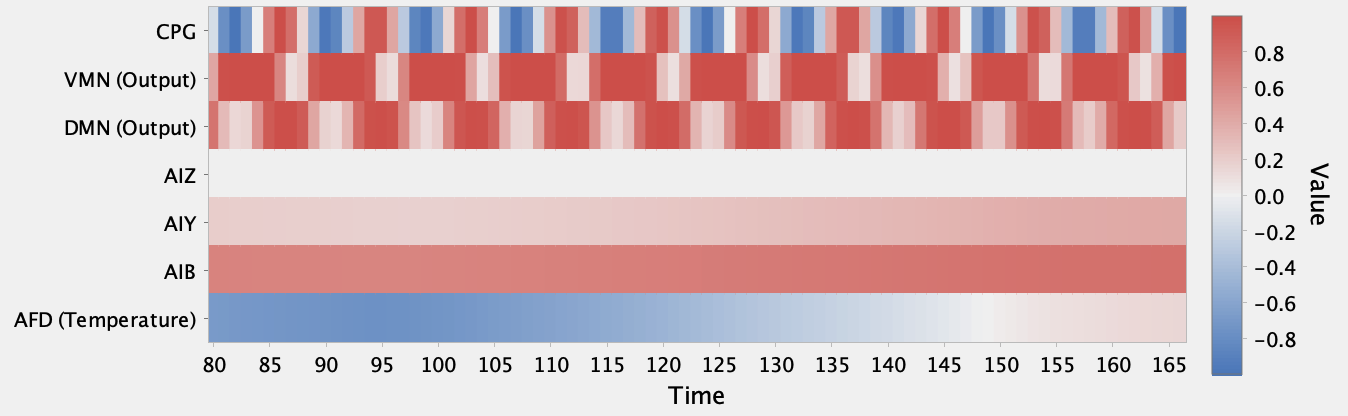
Like a raster plot, a heat map shows how a population changes over time. Raster plots mark discrete spikes or threshold crossings, while heat maps retain and display continuous values. This makes steady activity immediately visible: in this example AIZ stays near zero, AIY remains weakly positive, and AIB stays more strongly positive. The changing color bands also make periodicity and phase relationships easy to compare. Here the CPG repeats about every eight time steps, while VMN and DMN repeat about every ten, so the CPG oscillates about 25 percent faster.
Use Insert > New Plot > Heat Map to create an empty heat map. You can also use the plot action offered by compatible network objects to create and couple one directly. Coupling a vector producer appends one column of values at each update. When the source provides component names, they are shown as row labels.
Preferences
-
Color map: Selects how values are mapped to colors. Options are Jet, Hot, Grayscale, and Cool to hot.
-
Auto range: Expands the color range to cover the values currently retained in the plot. The range remains symmetric around zero so the midpoint color has a consistent meaning.
-
Color range lower bound and Color range upper bound: Set the fixed color range when Auto range is off. Simbrain uses their larger magnitude to maintain a symmetric range around zero.
-
Fixed width: Retains only a rolling window of the most recent time steps.
-
Window size: Sets the number of time steps retained when Fixed width is enabled.
Use the plot’s clear command to remove the recorded data.